Two-tone kitchen cabinets — a configuration guide, not a mood board
Two colors in one kitchen only works when the decisions underneath it are right — which tone goes up, which goes down, where the split lands, and how you tie it together so it reads intentional instead of busy. This is the how-to-configure-it guide, and the lowest-risk way in is usually a single contrasting island.
Which color goes on top, and which on the bottom?
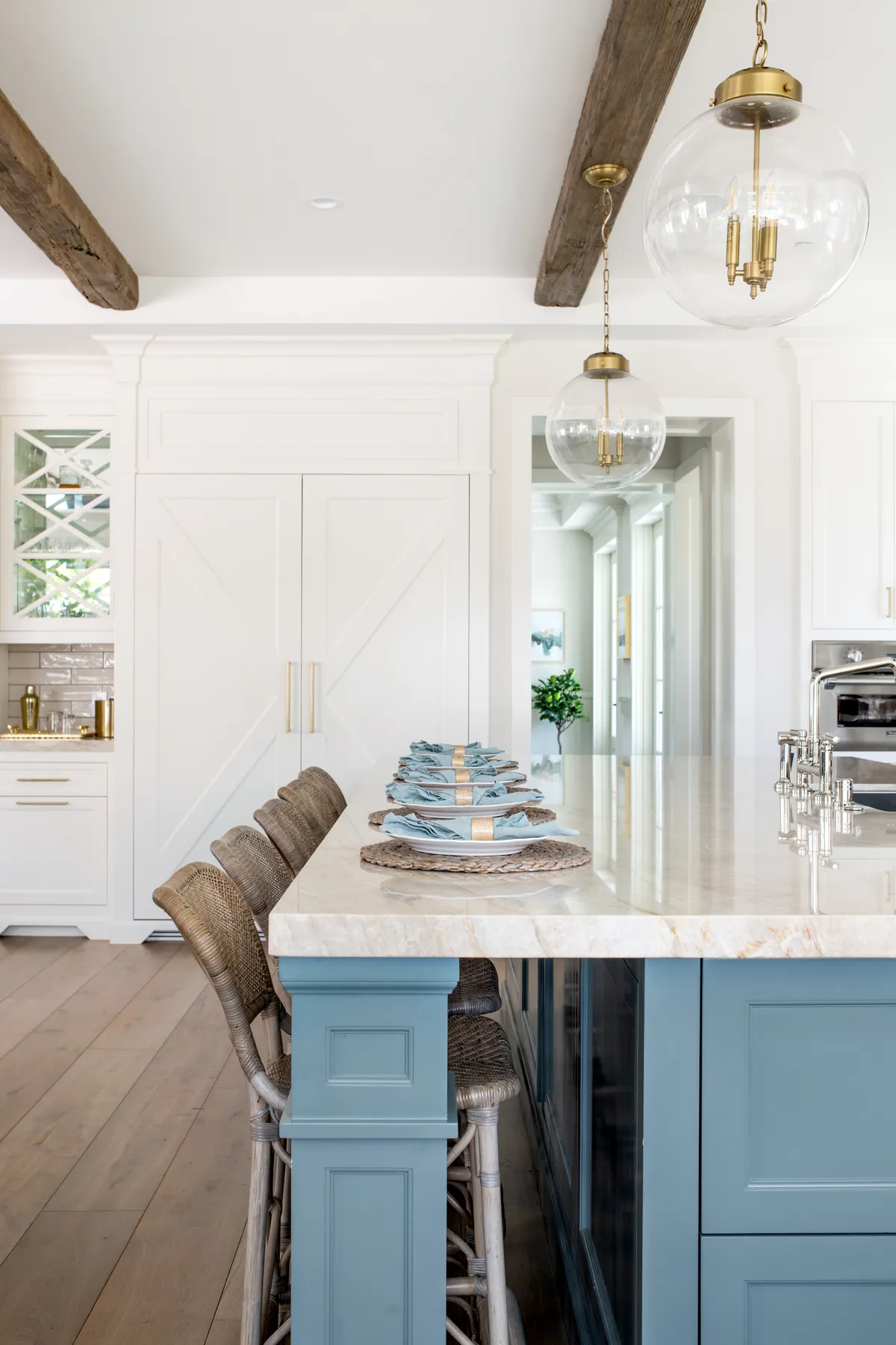
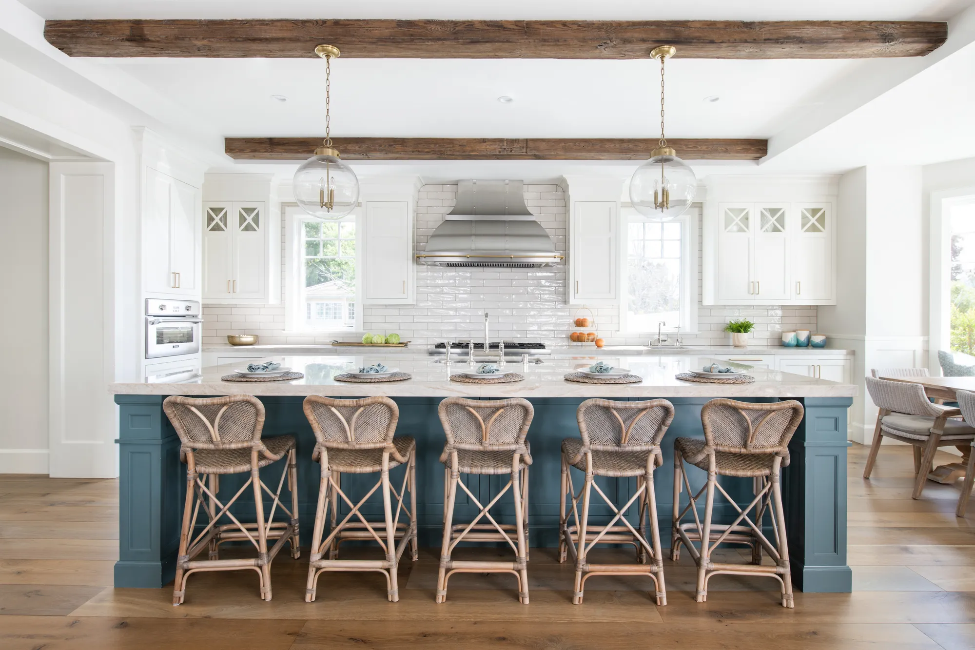
The default that almost always works: the lighter tone up, the darker or warmer tone down. Light uppers keep the room feeling open and let the wall cabinets recede, while a darker or wood-grain base grounds the kitchen the way a darker floor grounds a room — heavier at the bottom, lighter as your eye rises. It's the same instinct as dark trousers under a light shirt, and it's why dark-bottom, light-top is the safest two-tone configuration. Reversing it — dark up, light down — can work in a tall, well-lit kitchen, but it's the harder version and easy to get wrong.
Keeping two-tone from looking dated comes down to two rules. First, limit yourself to two tones — a perimeter color and one contrast — because a third color is where the room tips from designed to busy. Second, tie the two together with the elements that touch both: one hardware finish across every door, and a countertop and backsplash that bridge the palette rather than picking a side. When two-tone dates, it's almost never the two colors — it's an unresolved third element or a split that no material carries across.
Start with one contrasting island
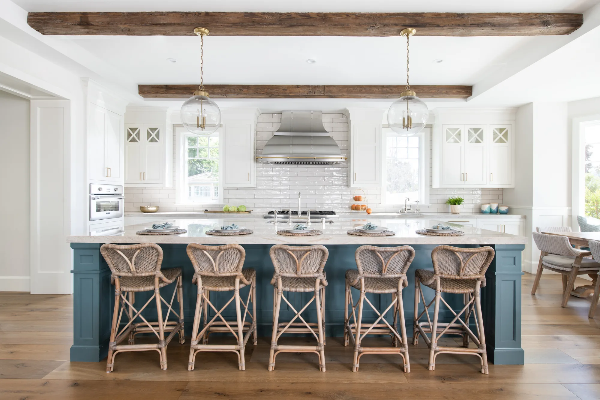
If two-tone feels like a big swing, don't split the perimeter at all — put all the contrast in one place. A contrasting island (or a natural-wood island in an otherwise painted kitchen) gives you the whole two-tone effect in a single, self-contained move: if you ever tire of it, you're repainting or refacing one piece, not the entire room. It's the configuration we most often steer first-time two-tone clients toward, because the risk is contained and the payoff is immediate.
For combinations that tend to age well: white perimeter with a white-oak island reads warm and current; a soft sage paired with a creamy white feels calm and organic; navy with unlacquered or brushed brass hardware is the confident, high-contrast option. Looking toward 2026, the leaning is for lowers and islands to trend toward wood, blue, and green while uppers stay light and quiet — a direction that also happens to be the most forgiving version of the light-up, grounded-down rule.
Design a contrasting island →How a two-tone kitchen comes together
A contrasting island
The lowest-risk entry point — all the two-tone effect in one piece you can size to your walkways and rethink later without touching the rest of the room.
Learn more →Cabinet colors guide
Picking the pair is the whole game. Which perimeter, which contrast, and how the two read together in your actual light — start here before you commit.
Learn more →White oak lowers or island
Natural white oak is the wood half of the most-requested white-and-wood pairing — warm, current, and an easy bridge between painted and grained cabinetry.
Learn more →Counters that unify two tones
The countertop and backsplash are what carry across the split. We choose a surface that bridges both colors instead of taking a side.
Learn more →Finish consistency
Two tones expose any mismatch in sheen or grain. Full-custom construction is how the paint on the perimeter and the finish on the island read as one intentional kitchen.
Learn more →Custom cabinetry
We build two-tone full-custom, so the door style, reveal, and both finishes are tuned to your room rather than pulled from two separate catalog lines.
Learn more →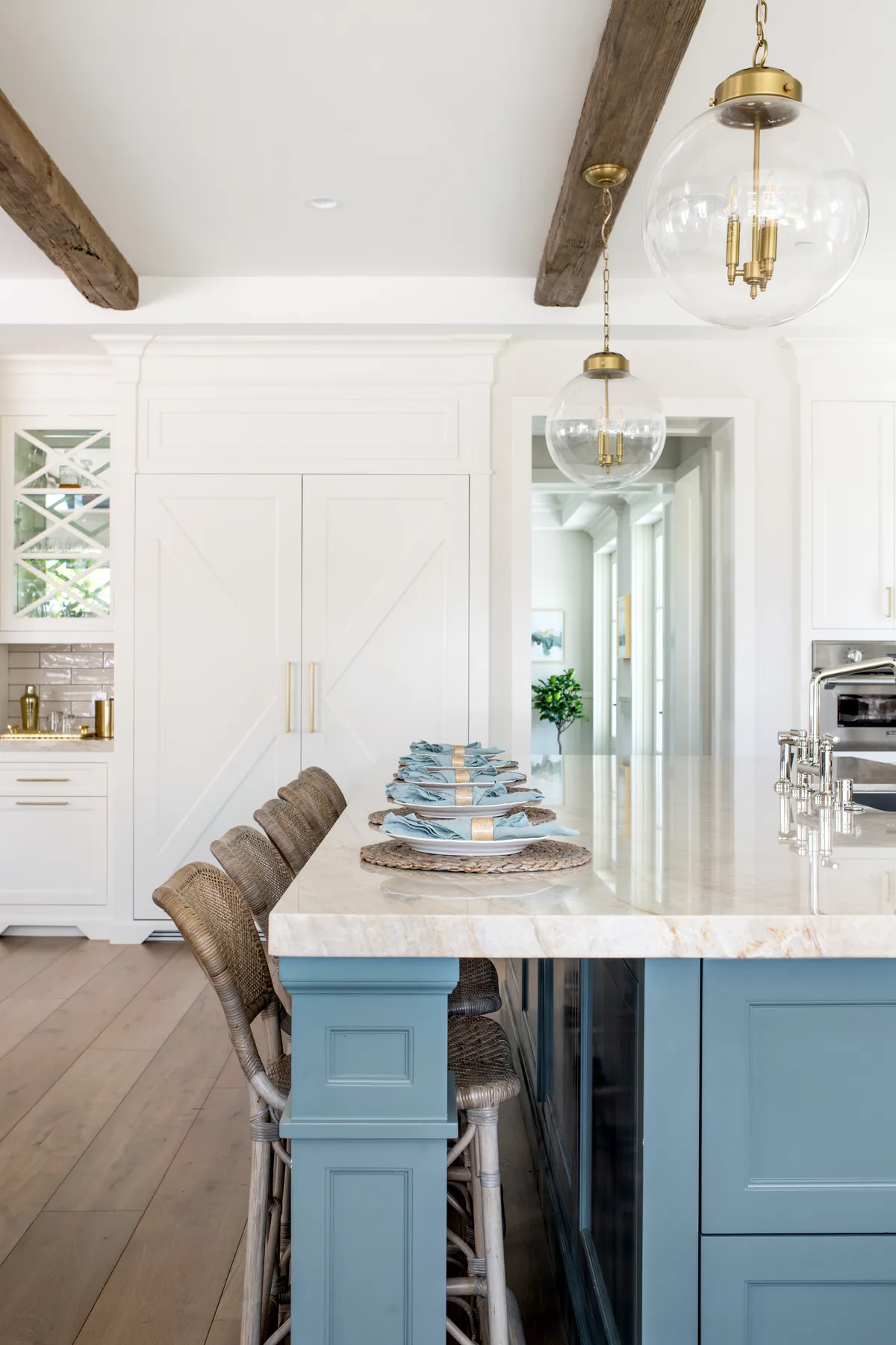
Two-tone rarely dates because of the two colors. It dates because of the third one — or a split no material carries across.
Where two-tone lands in the homes we build in
In the open-concept beach homes across Hermosa, Manhattan Beach, and Redondo, a grounding dark or wood island does real work: when the kitchen is visible from the living and dining space, that darker mass becomes a sightline anchor that gives the whole open plan a center of gravity, instead of a wall of uniform white dissolving into the room behind it.
The larger kitchens in Palos Verdes and Rancho Palos Verdes have the scale to carry a full perimeter-versus-island contrast — long runs of cabinetry where two distinct tones have room to breathe and read as deliberate. A compact Hermosa galley usually can't hold that much contrast without feeling chopped up, which is exactly where the single-island approach earns its place. Matching the configuration to the room is the part a specialist gets right.
See the cities we serve →Why a specialist builds two-tone better.
The pairing, dialed to your light.
The right two tones on a chip can read wrong on your walls. We test the pair in your actual room before anything is ordered.
One accountable team.
Design through final walkthrough under one roof — so the perimeter and the island are built to match, not sourced from two places that never meet.
A fixed written scope.
Quoted in writing before we start, with a line-item breakdown. No vague bids, no surprise change orders.
Licensed & insured.
Milestone payments tied to real progress — never a big check up front — backed by our 2-year workmanship warranty.
Two-tone cabinet questions
Which cabinet color goes on top and which on the bottom?
The reliable default is lighter on top, darker or wood-grain on the bottom. Light uppers keep the room open and let the wall cabinets recede, while a darker base grounds the kitchen the way a darker floor grounds a room. Dark-bottom, light-top is the safest configuration; reversing it can work in a tall, bright kitchen but is harder to pull off.
Are two-tone cabinets going out of style?
No — two-tone has moved from a trend to a standard tool, especially the white-perimeter-with-contrasting-island version. What actually dates a two-tone kitchen is over-doing it: a third cabinet color, or a split that no counter or hardware carries across. Kept to two tones and tied together, it reads intentional and lasts.
What's the most popular two-tone combination?
White and wood — a white or off-white perimeter with a natural white-oak island or base — is the most-requested pairing because it's warm, current, and hard to date. Close behind are sage with a creamy white, and navy with brass hardware for a higher-contrast, more confident look.
Should my island be a different color?
A contrasting island is the single best entry point into two-tone. You get the full effect in one self-contained piece, and if your taste changes you're refinishing one island rather than the whole room. It's the low-risk configuration we most often recommend first.
Do two-tone cabinets cost more?
A little, and not always. Running two finishes can add a modest setup or finishing cost versus a single color, but the bigger cost drivers are still cabinet construction, counters, and appliances — not the number of colors. A contrasting island keeps any added cost contained to one piece. We price yours in writing.
How many colors is too many?
Two is the sweet spot: a perimeter tone and one contrast. A third cabinet color is usually where a kitchen tips from designed to busy. If you want more variation, add it through materials that aren't cabinet paint — wood, stone, and metal — rather than a third painted tone.
What countertops work with two-tone cabinets?
Choose a counter that bridges both tones instead of matching one. A quartz or quartzite with soft, neutral veining reads calm against a light perimeter and a darker island and keeps the split from feeling abrupt. The counter and backsplash are the elements that carry across the two colors, so they're where two-tone is won or lost.
Let's configure a two-tone kitchen that reads intentional
Tell us about your kitchen and we'll help you place the split, pick the pair, and decide whether a contrasting island is the right first move. A real person answers — usually the same day.